AustLit
-
Dimensions: 38.5 x 29.0 x 4.5 cm
Accession no: 2007.12.c
Copyright line: All artworks that appear on this website do so with the consent of the copyright holder. No image or information displayed on this site may be reproduced, transmitted or copied other than for the purpose of fair dealing (e.g. for research and study) as permitted under the Copyright Act 1968 and subsequent amendments, without the permission of the copyright holders and UQ Art Museum.
-
Wolfgang Schivelbusch wrote about the landscape through a traveller’s perspective when he wrote the book The Railway Journey: The Industrialization of Time and Space in the 19th Century. What he argues in the chapter Panoramic Travel is that once you travel in speed you’re losing control of your senses.
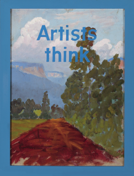
This is close to what happens when you look at Ian Burn’s triptych of Artists think no. 2 from 1993. The body of work is consisting three parts; the first one has a blue frame with a landscape that contains a muddy road, green trees and mountains with blue text in the foreground: Artist think. The second one has a yellow frame with another landscape that looks similar to a beach. In the center there are trees that are covered with a yellow font: Artist think with their eyes, and in the background you can see the blue ocean leaning upon the shore. In the third part of the triptych it feels like you are standing on a cliff looking out in the far distance through a red frame, with a blue river that the bush surrounds with its green colors covered with red text: Artist think with their eyes open.
The connection with Schivelbusch is as follows: The spectator is confronted by Burn’s artworks, and tries to separate landscape and text from each other. However, when we try to ignore the text and only look at the image itself, the text reappears. Even though we are not looking at Burn’s artworks in velocity, we are still struggling to get sense of, and separate parts of it, just as we would if we were sitting on a train somewhere. It is just as difficult to separate word and image, as it is to distance yourself to certain objects when we travel through time. What we do is to try and ignore parts of the landscape that are close to us, because they are just passing us by like streaks. What we do instead is to focus our gaze on objects that are more distant so that we slowly can se what is in front of our eyes.
His earlier works are different from the triptych, as his Self-Portrait from 1963 for example where he reduced some of the details from an earlier self-portrait and instead had a blue outline on a pink wall. Years later Burn started working on the idea of crossing geometry with geography, where he then got busy in the language of mirrors and photocopies, as one can see in the work from 1968, Ungrammatical Landscape.
You might be interested in...
